Applying the principles of typography in animation
The cover of ‘Thinking with type’ by Ellen Lupton really caught my eye. Having read the blurb on the back, I hoped it would help us elevate our typography in animation that we make.
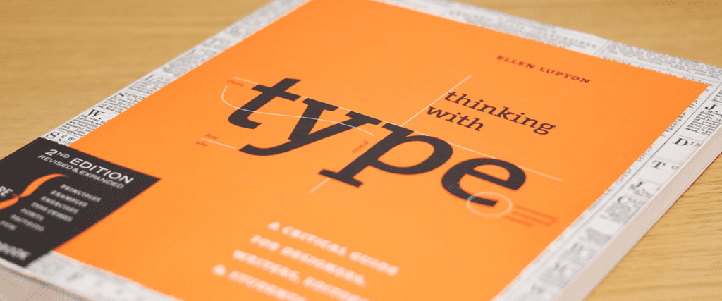
The book is really a ‘critical guide for designers’
The book chronicles the history of typography, explaining in great detail what typography is and how it has evolved. It’s important to understand the different uses of typography because they were made with various intentions.
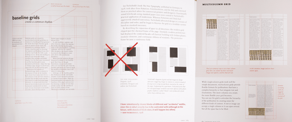
Lumpton selects great examples to show how experts make use of the page, be it a book or a tightly squeezed magazine. She really brings a fresh perspective to the layouts we all see day to day. Factors to be considered when designing the page layout are the size of margins, gutters, columns and rows.
“A grid can be simple or complex, specific or generic, tightly defined or loosely interpreted. Typographic grids are all about control.”
Lupton reveals in-depth insight on the methods designers can follow to achieve a clean, well-organised page or intentional chaos that breaks the space. It depends what the designer wants to communicate to their audience. You can really let your creativity run wild and it is good to know what methods to use for experimentation.
Making reading less of a chore
The author’s clever use of image placement, margins and text alignment makes reading less of a chore. It’s a much more enjoyable learning experience, especially for people like me, who are visual learners.
Here are a few key takeaways from the book;
- It’s ok to have more than one typeface in a design.
- A font is how the typeface is delivered (the digital file such as the .otf or .ttf,) a typeface is the design of the letters.
- small capitals are a thing. Instead of using ‘ALL CAPS’ which makes it looks like YOU’RE SHOUTING, you can apply small caps to match the x-height (x-height is height of your lowercase text) to give a clean line with no ascending elements.
Applying Typography in Animation
I can now really appreciate the craft of type, layout and the process graphic designers consider when designing. I can look at a book and think about the thought process the designer must have gone through to reach the final design. It’s definitely enhanced my understanding of type and the importance of it. Something I can now apply to any typography based motion design for even more experimental outcomes.
If you want to develop your knowledge of type for your design work, or just want to learn more about the something you see ever day, I’d highly recommend this book. It’s now my typography bible, so I can always refer back to it if I do ever forget!
Explore our explainer animations